
Creating a reusable calendar component in Angular
Show customizable markers on the calendar easily.
Full stack web developer with main focus in Angular and NodeJs. Loves creating blogs, a side projects when I can find time.
Recently, I came across a tweet where someone posted a calendar component that was used for tracking different subscriptions. The tweet was trending because the design looks really good. I was working a project which could use a calendar component, so I decided to give it a try.
So today we are going to see exactly how I created a reusable calendar component in Angular.
Getting started
We are going to be using the latest and greatest Angular version 18.0.0 (at the time of writing this blog). We are going to use standalone component, along with signals. One important dependency that we are going to add is date-fns library, which is a modern JavaScript date utility library. It provides the most comprehensive, yet simple toolset for working with dates.
Let's start by creating the component. I'm just going to add the bare minimum template code. You can get the full template code from the source code link at the end of this blog.
Building the calendar component
@Component({
  selector: 'app-calendar',
  standalone: true,
  template:`
    <div>
      <header>
         <!---- Calendar month be displayed here -->
         <h1></h1>
         <div>
            <button>Today</button>
            <button>Previous</button>
            <button>Next</button>
         </div>
      </header>

      <div>

        <!---- Calendar days be displayed here -->
        <header class="grid grid-cols-7">
          @for (item of this.dayNamesEnriched; track item.dayName) {
              <div>
                {{ item.dayName }}
              </div>
          }
        </header>
      </div>
    </div>
  `
})
export class CalendarComponent {
  public markers = input<CalendarMarkerData[]>([]);
  public markerTpl = input<TemplateRef<{ $implicit: CalendarMarkerData[] }>>();

  readonly #dayNames = ['Sun', 'Mon', 'Tue', 'Wed', 'Thu', 'Fri', 'Sat'];
  protected readonly dayNamesEnriched = this.#dayNames.map((dayName) => ({
    dayName: dayName,
    isToday: dayName === format(startOfToday(), 'eee'),
  }));

  protected currentDate = signal(startOfToday());
  protected currentMonthWithYear = computed(() =>
    format(this.currentDate(), 'MMMM yyyy'),
  );

  protected readonly startDateOfSelectedMonth = computed(() => {
    return startOfMonth(this.currentDate());
  });
  protected readonly endDateOfSelectedMonth = computed(() => {
    return endOfMonth(this.currentDate());
  });

  protected readonly days = computed(() => {
    return eachDayOfInterval({
      start: this.startDateOfSelectedMonth(),
      end: this.endDateOfSelectedMonth(),
    });
  });

  protected readonly daysEnriched = computed(() => {
    return this.days().map((day, i) => {
      return {
        day: day,
        isToday: isEqual(day, startOfToday()),
        colStartClass: i === 0 ? this.#COL_START_CLASSES[day.getDay()] : '',
        markers: this.#markersMap().get(this.getMarkerMapKey(day)) || [],
      };
    });
  });

  readonly #COL_START_CLASSES = [
    '',
    'col-start-2',
    'col-start-3',
    'col-start-4',
    'col-start-5',
    'col-start-6',
    'col-start-7',
  ];
}

export interface CalendarMarkerData<Data = any> {
  date: Date;
  data: Data;
}
This is all the code that is required for the calendar component. We have a header section where we display the month and year, along with buttons to navigate to the previous and next month. We also have a section where we display the days of the week. We are using the date-fns library to get the days of the week.
Adding markers to the calendar
Now that we have the basic calendar component, we can add markers to the calendar. Markers are used to show some data on a specific date. For example, if you have a subscription on a specific date, you can show a marker on that date. The marker data is passed to the calendar component as an input. We are using the input signal to pass the marker data to the calendar component.
The consumer has full control of how the markers look, making the calendar component highly customizable.
@Component({
  selector: 'app-main',
  standalone: true,
  template: `
  <div class="p-6">
    <app-calendar [markers]="this.markers" [markerTpl]="markerTpl">
    </app-calendar>
  </div>

    <ng-template #markerTpl let-data>
      <div class="flex items-center justify-center">
        <ul class="flex flex-col gap-1">
          @for(marker of data; track marker){
            <li class="flex bg-blue-100 text-center text-xs rounded-md px-2 py-1 justify-center items-center">{{marker.data.title}}</li>
          }
        </ul>
      </div>
    </ng-template>
  `,
  imports: [CalendarComponent],
})
export class MainComponent {
  markers: CalendarMarkerData[] = [
    {
      date: addDays(new Date(), 1),
      data: {
        title: 'Netflix',
      },
    },
    {
      date: addDays(new Date(), 1),
      data: {
        title: 'Google One',
      },
    },
    {
      date: addDays(new Date(), 5),
      data: {
        title: 'Youtube Premium',
      },
    },
  ];
}
We defined the marker template in the consumer and passed it to the calendar component. The calendar component will render the markers using the template provided by the consumer.
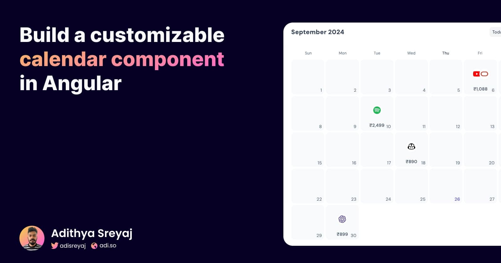
You can further style it to your needs, here’s some screenshots of how I did it:


Demo
Stackblitz:
https://stackblitz.com/edit/angular-calendar-with-date-fns
Connect with me