
Creating buttons with custom loading animations in Angular - Simple and Easy!
Give users a good UX by having subtle loading states right in the button.

Full stack web developer with main focus in Angular and NodeJs. Loves creating blogs, a side projects when I can find time.
I have previously written about How to create consistent buttons for your Angular projects using the power of Directives. We saw why it is necessary to maintain consistency in our applications and how it impacts the UX of the whole app.
Today we are going to see how we can create buttons that support loading states wherein the user will be able to visually see that something is happening in the background just by looking at the button.
Loading states
We see a lot of loading indicators on the internet, it's a way to tell the user to wait as something is being done in the background. But there are many websites that have implemented full page loaders, which makes the app unusable.
There are subtle ways to show loaders that give users the idea, but without being intrusive.
Buttons with loading states
Without much effort, we can implement buttons that can show a loading icon with a beautiful but subtle animation.
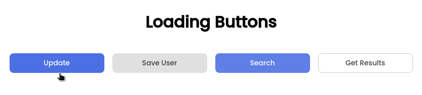
We are going to create a button component, which has a default loading icon. But we can provide custom loading icons easily using the power of content projection.
Creating the button component
I would normally create a separate library in the project called UI where I put all these common components. But for the sake of this tutorial, I will be lazy and just create a basic component.
1. Create the Button Module
We are going to create a module where our button component will be declared and then exported.
import { CommonModule } from "@angular/common";
import { NgModule } from "@angular/core";
import { AdiButtonComponent } from "./button.component";
import { AdiButtonLoaderIconDirective } from "./button.directive";
@NgModule({
  declarations: [AdiButtonComponent, AdiButtonLoaderIconDirective],
  imports: [CommonModule],
  exports: [AdiButtonComponent, AdiButtonLoaderIconDirective]
})
export class AdiButtonsModule {}
2. The Button Component
Here we are using a component instead of manipulating the button with a directive as we need access to the template.
import { Component, ContentChild, HostBinding, Input } from "@angular/core";
import { AdiButtonLoaderIconDirective } from "./button.directive";
@Component({
selector: "button[adiButton]",
template: `
<div class="label"><ng-content></ng-content></div>
<div class="loader">
<ng-container
*ngTemplateOutlet="icon?.tpl || defaultLoader">
</ng-container>
</div>
<ng-template #defaultLoader>
<!-- Animated SVG -->
</ng-template>
`,
styleUrls: ["./button.component.css"]
})
export class AdiButtonComponent {
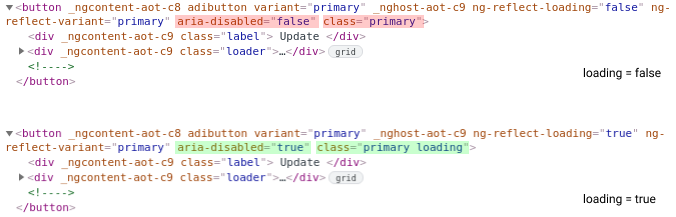
@HostBinding("class.loading")
@HostBinding("attr.aria-disabled")
@Input()
loading = false;
@HostBinding("class")
get classes(): string {
return this.variant || "primary";
}
@ContentChild(AdiButtonLoaderIconDirective)
icon: AdiButtonLoaderIconDirective;
constructor(
@Attribute("variant")
private variant: "primary" | "secondary" | "outline"
) {}
}
We'll break down the code after the customer loader directive is added.
3. Adding the Custom Loader Directive
This directive is basically used as a selector and doesn't have any other purpose. It just exposes the ElementRef of the element where it is applied on.
import { Directive, TemplateRef } from "@angular/core";
@Directive({
  selector: "ng-template[adiButtonLoader]"
})
export class AdiButtonLoaderIconDirective {
  constructor(public tpl: TemplateRef<any>) {}
}
We'll use the directive to later provide custom loaders to be shown in the button without having to make changes to the button component itself.
Code Breakdown
In the component the first thing that you you can see is that we have used something like this:
<div class="label"><ng-content></ng-content></div>
This is a concept called content projection. So the content that is provided between the opening and close of the element button[adiButton] will be displayed here.
This is how we use the component:
<button adiButton>
   Update
</button>
The content here is Update and the resulting HTML will be :
<div class="label">Update</div>
So this is how we give the label for the button. Nothing fancy here.
Next up, we have exposed to properties of the component
loading- whether loading icon should be shown or notvariant- button variants like primary, secondary button
Another thing that can be noticed is that we have couple of HostBinding used:
@HostBinding("class.loading")
@HostBinding("attr.aria-disabled")
@Input()
loading = false;

@HostBinding("class")
  get classes(): string {
    return this.variant || "primary";
  }

constructor(
    @Attribute("variant")
    private variant: "primary" | "secondary" | "outline" = "primary"
  ) {}
Here what happens is that when loading is true,
- a class called
loadingwill be added to the button. aria-disabledwill be set to true.variantwill just add the class to the button's class list.
Note: @Attribute directive is used instead of @Input for variant as the variant value will be static and we don't want angular to listen to changes to the property. Read more about it here.
 It's just a short-hand approach instead of manually writing getters for host binding.
Custom Loaders
We have created a directive for this very purpose. Let's see how we can provide different loaders without changing anything in the button component itself.
<button  adiButton>
   Save User
   <ng-template adiButtonLoader> Saving... </ng-template>
 </button>
In the case of the second button, I've replaced the spinner with a text and see how easy it is to do that. Similary you can provide other components or animated svgs inside the ng-template for substituting the default loader:
<button  adiButton>
   Save User
   <ng-template adiButtonLoader>
     <adi-search-loader></adi-search-loader>
   </ng-template>
 </button>
Here the component adi-search-loader is exposing a simple SVG image.
Customer Loaders - The details
This piece of code here, which we wrote in the button.component.ts is what is interesting.
 <div class="loader">
      <ng-container
        *ngTemplateOutlet="icon?.tpl || defaultLoader">
      </ng-container>
    </div>
    <ng-template #defaultLoader>
       <!-- Animated SVG -->
    </ng-template>
See that we have defined a defaultLoader template that contains our animated SVG image.
The loader is a container that contains a template outlet, the value we pass to it is the icon?.tpl which the TemplateRef that is exposed by our directive. If the user provides a custom ng-template with adiButtonLoader directive, the value of
icon?.tpl will be used and the provided content will be projected there and otherwise, it will fall back to our default loading icon.
Adding the Styles
The styles for different states and the animation for the state change are all handled by CSS. We don't need to add more code to do the work which can be done using CSS.
:host selector is used here because in our case the host is the <button></button> element and we are styling it directly.
:host {
  --primary: hsl(229, 76%, 66%);
  --primary-dark: hsl(229, 76%, 62%);
  --primary-disabled: hsl(229, 56%, 80%);
  --secondary: hsl(0, 0%, 88%);
  --secondary-dark: hsl(0, 0%, 82%);
  --secondary-disabled: hsl(0, 0%, 90%);
  position: relative;
  padding: 0.5rem 2rem;
  font-size: 14px;
  border: 1px solid transparent;
  background: none;
  border-radius: 8px;
  cursor: pointer;
  outline: none;
  font-family: "Poppins", sans-serif;
  font-weight: 500;
}

.label {
  opacity: 1;
  transform: translateY(0);
  transition: transform 0.2s cubic-bezier(0.17, 0.67, 0.79, 1.03);
}
.loader {
  position: absolute;
  top: 0;
  left: 0;
  width: 100%;
  height: 100%;
  display: grid;
  place-items: center;
  opacity: 0;
  transform: translateY(5px);
  transition: transform 0.2s ease-in-out;
}

/* Primary Button Variant Styles */
:host(.primary) {
  background: var(--primary);
  color: #fff;
}
:host(.primary:hover) {
  background: var(--primary-dark);
}
:host(.primary:not(.loading):focus) {
  background: var(--primary-dark);
  box-shadow: inset 0 0px 0px 1.5px #fff, 0 0px 0px 2px hsl(229deg 76% 66%);
}
:host(.primary.loading) {
  pointer-events: none; /* <-- Disables button click */
  background: var(--primary-disabled);
}

/* Loading Styles */
:host(.loading) .loader {
  opacity: 1;
  transform: translateY(0px) scale(1);
}
:host(.loading) .label {
  opacity: 0;
  transform: translateY(-10px);
}
Styles for other variants are included in the CodeSandbox version. Also, you can see that I've added few extra styles for focus and hover states as I don't want to be that developer who doesn't give a damn about accessibility!
Code
🌎 Connect with me

Do add your thoughts in the comments section. Stay Safe ❤️