

A simple but customizable accordion component in Angular
How to create a super simple accordion component in Angular. Using the power of content projection in Angular, we are going to build an accordion/expansion panel that can be customized in multiple ways.
Accordions
Accordions in general are vertically stacked lists of headers when clicked reveals some content. Accordions or expandable sections are seen as part of almost all the UI libraries out there.
If we take a look at Angular material, we have Expansion Panel (ref) and in Ng Bootstrap its called simple Accordion (ref).
Building a custom accordion
What we are gonna build is a much simpler version of these. And as always, the whole idea behind this is to help you explore some possibilities of Angular. This blog post would be mostly about how we can use Content Projection (ref) in Angular to create reusable and customizable UI components.
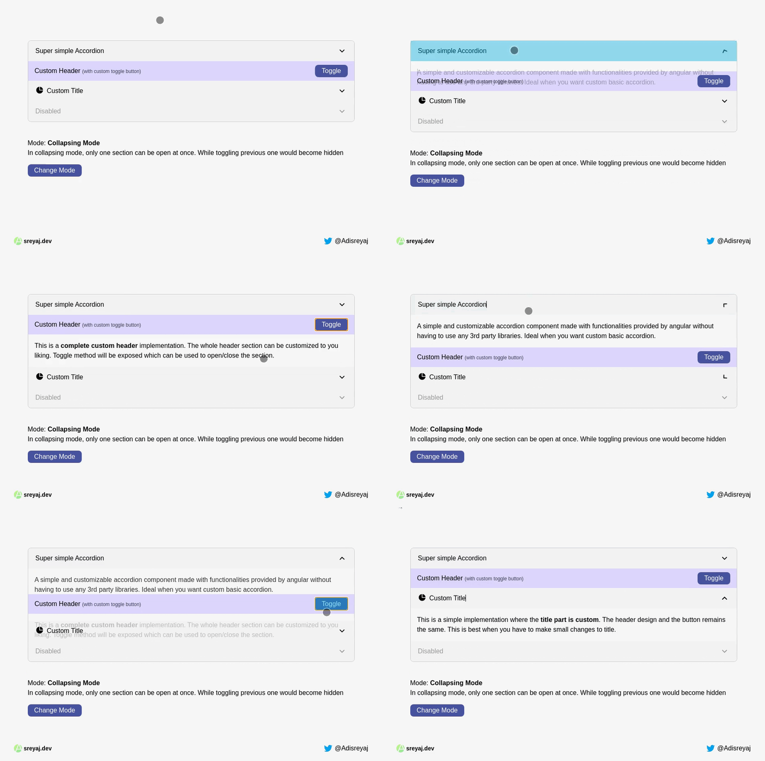
We are not going to rely on any 3rd party library for building our component. We are going to use Directives, TemplateRef, Animation etc in this post.
Planning it out
If we see the anatomy of an accordion component, we need a main parent container to accommodate all the different items inside. Each of the items will contain a header and a content part.
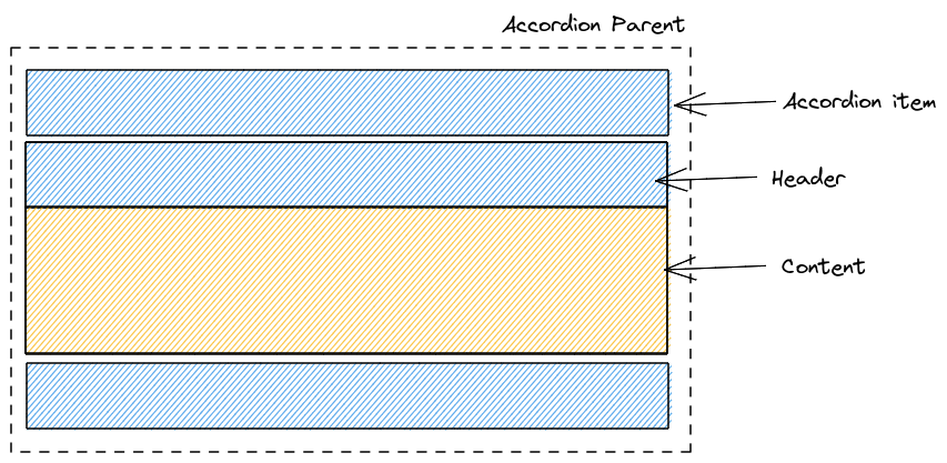 The content part is completely dynamic and we don't have to worry about it. When it comes to the header, there will be:
- Default header with title and the toggle icon
- Default header with custom title
- Completely custom header
Building Accordion component
Let's start by creating a dedicated module for the component. Here are the items that we need to create along with the module:
- Accordion Parent Component
- Accordion Item Directive
- Accordion Header Directive
- Accordion Title Directive
- Accordion Content Directive
lib/
├─ accordion/
│  ├─ directives/
│  │  ├─ accordion-item.directive.ts
│  │  ├─ accordion-content.directive.ts
│  │  ├─ accordion-title.directive.ts
│  │  ├─ accordion-header.directive.ts
│  ├─ accordion.component.html
│  ├─ accordion.component.css
│  ├─ accordion.component.ts
│  ├─ accordion.module.ts
Here's how the module will look like:
import { CommonModule } from "@angular/common";
import { NgModule } from "@angular/core";

import { AccordionComponent } from "./accordion.component";
import { AccordionItem } from "./directives/accordion-item.directive";
import { AccordionContent } from "./directives/accordion-content.directive";
import { AccordionTitle } from "./directives/accordion-title.directive";
import { AccordionHeader } from "./directives/accordion-header.directive";

@NgModule({
  declarations: [
    AccordionComponent,
    AccordionItem,
    AccordionContent,
    AccordionTitle,
    AccordionHeader
  ],
  imports: [CommonModule],
  exports: [
    AccordionComponent,
    AccordionItem,
    AccordionContent,
    AccordionTitle,
    AccordionHeader
  ]
})
export class AccordionModule {}
We start with the directives first, as most of them will be used as selectors and will not have any logic inside them. We inject the TemplateRef so that we can get access to the template reference of the host elements where these directives are placed.
Content Directive
@Directive({
  selector: "[accordionContent]"
})
export class AccordionContent {
  constructor(public templateRef: TemplateRef<any>) {}
}
Header Directive
@Directive({
  selector: "[accordionHeader]"
})
export class AccordionHeader {
  constructor(public templateRef: TemplateRef<any>) {}
}
Title Directive
@Directive({
  selector: "[accordionTitle]"
})
export class AccordionTitle {
  constructor(public templateRef: TemplateRef<any>) {}
}
Item Directive
@Directive({
  selector: "accordion-item"
})
export class AccordionItem {
  @Input() title = "";
  @Input() disabled = false;
  @ContentChild(AccordionContent) content: AccordionContent;
  @ContentChild(AccordionTitle) customTitle: AccordionTitle;
  @ContentChild(AccordionHeader) customHeader: AccordionHeader;
}
In the item directive, we set some @Input() for getting data from the user. And We have taken the reference of the content, title, and the header using the @ContentChild() (ref) decorator.
This is how the title, content, and header will be passed in the template:
<accordion-item>
     <ng-template accordionHeader>ng-template>
     <ng-template accordionTitle>ng-template>
     <ng-template accordionContent>ng-template>
</accordion-item>
Once we have the basic setup ready, the main component is the AccordionComponent or the parent component.
Accordion component
We have to essentially manage only a single state for managing the expanded items.
@Component({
  selector: "accordion",
  templateUrl: "./accordion.component.html",
  styleUrls: ["./accordion.component.css"],
  changeDetection: ChangeDetectionStrategy.OnPush,
})
export class AccordionComponent {
  expanded = new Set<number>();
  /**
   * Decides if the single item will be open at once or not.
   * In collapsing mode, toggling one would collapse others
   */
  @Input() collapsing = true;

  @ContentChildren(AccordionItem) items: QueryList<AccordionItem>;

  /**
   * Make the toggle function available to be called from
   * outside.
   * @param index - Index of the accordion item
   */
  getToggleState = (index: number) => {
    return this.toggleState.bind(this, index);
  };

  toggleState = (index: number) => {
    if (this.expanded.has(index)) {
      this.expanded.delete(index);
    } else {
      if (this.collapsing) {
        this.expanded.clear();
      }
      this.expanded.add(index);
    }
  };
}
A Set is used to maintain the state of currently expanded accordion items. A set guarantees distinct values.
@ContentChildren(AccordionItem) items: QueryList<AccordionItem>;
This will give us the accordion items in the template which can be used to iterate and display the contents in the view.
An input collapsing is taken from the user which defines the behavior of the accordion. It tells the accordion whether to close other items when an item is expanded.
- collapsing = true will make sure there will be only one item open at a time
- collapsing = false means multiple items can be open at once
A function called toggleState is added which basically toggles the state of an item. We pass the index of the item, it will check and expand/collapse the item.
The getToggleState function is a special one which I will discuss in a bit.
Accordion component template
Let's now see how this is all laid out.
<section class="accordion">
  <div *ngFor="let item of items;index as i"
    class="accordion__item" [class.disabled]="item.disabled" [class.active]="expanded.has(i)">
    <ng-container
      [ngTemplateOutlet]="(item?.customHeader?.templateRef || defaultHeader)"
      [ngTemplateOutletContext]="{$implicit: item, index: i, toggle: getToggleState(i)}"></ng-container>
    <div class="accordion__content" [class.expanded]="expanded.has(i)" [@contentExpansion]="expanded.has(i) ? 'expanded':'collapsed'">
      <ng-container *ngTemplateOutlet="item?.content?.templateRef"></ng-container>
    </div>
  </div>
</section>

<ng-template #defaultHeader let-item let-index="index">
  <header class="accordion__header"
    (click)="item.disabled ? {} :toggleState(index)">
    <ng-container *ngTemplateOutlet="item?.customTitle?.templateRef || defaultTitle"></ng-container>
    <button class="accordion__toggle-btn" [disabled]="item.disabled">
      <svg
        xmlns="http://www.w3.org/2000/svg"
        viewBox="0 0 24 24" width="24" height="24">
        <path fill="none" d="M0 0h24v24H0z" />
        <path d="M12 13.172l4.95-4.95 1.414 1.414L12 16 5.636 9.636 7.05 8.222z"/>
      </svg>
    </button>
  </header>
  <ng-template #defaultTitle>
    <p class="accordion__title">{{item?.title}}</p>
  </ng-template>
</ng-template>
We are just iterating over the items array (Querylist), which basically is a list of the accordion-items passed inside our accordion component.
Content Projection
<ng-container
      [ngTemplateOutlet]="(item?.customHeader?.templateRef || defaultHeader)"
      [ngTemplateOutletContext]="{$implicit: item, index: i, toggle: getToggleState(i)}">
</ng-container>
If the user has provided a custom header, we use that template or we use our defaultHeader. We use something called ngTemplateOutlet (ref) to project the template into the view.
ngTemplateOutletContext is used to pass some information into the template. We pass:
item- the current accordion item.index- index of the accordion item (required for toggling it).toggle- a function that can be called to toggle the accordion item.
The toggle property is a function that has the current context and the index bound to it. So whenever it's called, that particular item will automatically be toggled without passing the index value to the function.
Also, see that it's an arrow function, that is the reason we can call the toggleState function with the proper context (this).
getToggleState = (index: number) => {
  return this.toggleState.bind(this, index);
};
Note: If you are worried about using methods in the template, there are two ways to make this code better:
1. Memoize the getToggleState method
import { memoize } from 'lodash-es';

getToggleState = memoize((index: number) => {
  console.log('Called');
  return this.toggleState.bind(this, index);
})
2. Use Custom Pipe
@Pipe({
  name:'getToggleFunction'
})
export class TogglePipe implements PipeTransform{
  transform(i: number, toggleFn: Function){
    return () => toggleFn(i);
  }
}
and make necessary change the template:
<ng-container
  [ngTemplateOutlet]="(item?.customHeader?.templateRef || defaultHeader)"
  [ngTemplateOutletContext]="{$implicit: item, index: i, toggle: i | getToggleFunction: toggleState}"
</ng-container>
Usage
This is how we use the ngTemplateOutletContext:
<ng-template #defaultHeader let-item let-index="index"></ng-template>
When let-item is called, it refers to the implicit property that we attached ({$implicit: item}). It just means that its the default value to use when the user didn't specify which property they want (see how index is queried).
By adding let-index="index", we are assigning the index property to a variable called index. This would make the variable available to use within the template.
Finally, lets see how we can use the component. First thing is that the AccordionModule should be imported before it can be used.
Here are all the different ways you can use the component:
Basic usage
<accordion [collapsing]="collapsing">
    <accordion-item title="Super simple Accordion">
        <ng-template accordionContent>
          <div class="p-4">
            A simple and customizable accordion component.
          </div>
        </ng-template>
    </accordion-item>
</accordion>
With Custom title
<accordion [collapsing]="collapsing">
   <accordion-item>
      <ng-template accordionTitle>
          <div class="flex space-x-2">
            <p>Custom Title</p>
          </div>
        </ng-template>
        <ng-template accordionContent>
            <div class="p-4">
              This is a simple implementation where title part is custom.
            </div>
        </ng-template>
     </accordion-item>
</accordion>
With Custom Header
<accordion [collapsing]="collapsing">
   <accordion-item title="Super simple Accordion">
     <ng-template accordionHeader let-toggle="toggle">
          <div class="flex items-center justify-between px-4 h-12 bg-purple-200">
            <p> Custom Header <span>(with custom toggle button)</span><p>
            <div class="flex space-x-2">
              <button (click)="toggle()">Toggle</button>
            </div>
          </div>
        </ng-template>
        <ng-template accordionContent>
            <div class="p-4">
              This is a <strong>complete custom header</strong> implementation.
            </div>
        </ng-template>
      </accordion-item>
</accordion>
See how the toggle function is first defined let-toggle="toggle" and then used in the button <button (click)="toggle()">Toggle</button>
This is how you can create a simple, but a customizable accordion component in angular.
Bonus: Animations
I have added Angular animations for animating the content when the user toggles the accordion item.
Only two things have to be added for this. First we need to defined our animation in the @Component decorator (ref):
@Component({
 // --- removed for brevity
  animations: [
    trigger('contentExpansion', [
      state('expanded', style({height: '*', opacity: 1, visibility: 'visible'})),
      state('collapsed', style({height: '0px', opacity: 0, visibility: 'hidden'})),
      transition('expanded <=> collapsed',
        animate('200ms cubic-bezier(.37,1.04,.68,.98)')),
    ])
  ]
})
export class AccordionComponent {}
and then in the template:
<div class="accordion__content" [@contentExpansion]="expanded.has(i) ? 'expanded':'collapsed'">
      <ng-container *ngTemplateOutlet="item?.content?.templateRef"></ng-container>
</div>
We add the animation trigger to the div and pass the state based on the expanded condition. This gives us a smooth animation when toggling the panel.
All the styles that are required for the accordion are in the accordion.component.css file. TailwindCSS is used only for styling the main application.
Code and Demo
Demo: https://ssscp.csb.app
Code: https://codesandbox.io/s/ng-accordion-ssscp
Code with Pipe: https://codesandbox.io/s/ng-accordion-optimized-49bxr
Connect with me
Do add your thoughts in the comments section. Stay Safe ❤️

About the author
Full stack web developer with main focus in Angular and NodeJs. Loves creating blogs, a side projects when I can find time.
Comments
Join the discussionThanks, this is a very useful bit of code. I was not able to get it working with ngFor to populate items. If it should work is there a sample?
is it possible to be an accordion item expanded when the component is shown?
Can you rephrase your question? I don't quite follow.
Adithya Sreyaj looks like asking for initially open items.
I've update the code to add support for initial expand conditions:
merge(this.items.changes, of(this.items))
      .pipe(map(() => this.items.toArray()))
      .subscribe((items) => {
        items.forEach((item, index) => {
          if (item.expanded) {
            this.expanded.add(index);
          }
        });
        this.cdr.detectChanges();
      });
Great Tutorial.
The only problem I am having is that my application is not loading and stays in a white screen because of the following error in the console log. I am importing it correctly into the app.module.ts file.
This is the error I am getting.

Glad it helped 💫
Hi there
Great article, helped me understand accordion's better!!
One question, how can you add a "hat" to the accordion as per the image?

Thanks! Glad you found it helpful.
I am not sure If I understand what you meant. Can you rephrase it?
Great I used this and enjoyed it
Glad you found it useful!
Super Informative and I just the loved your explanation. waiting for more angular related articles.
Thanks Suraj, appreciate the feedback!


