

Super Simple Select Implementation Using Angular CDK Selection Model

Full stack web developer with main focus in Angular and NodeJs. Loves creating blogs, a side projects when I can find time.
Building out Selection feature for tables/list can be challenging at times, because of a lot of corner case that needs to be handled. Here's how we can build one without writing much logic using the Angular CDK's SelectionModel utility.
Angular CDK SelectionModel
Angular CDK comes with a lot of utilities and components that we can use to build our application. One such very useful utility is the SelectionModel utility that is part of the Collections utilities in Angular Material CDK.
SelectionModel is a utility for powering the selection of one or more options from a list. This model is used in components such as the selection list, table selections, and chip lists.
Understanding the API ℹ️
The Selection Model class comes with a lot of handy methods that make it super easy to maintain the state of selections. Here's how we can use it:
const selectionModel = new SelectionModel<string>();
The class constructor takes in these arguments:
multiple- whether we can select multiple items at a time (multi-select)initiallySelectedValues- initial selectionemitChanges- Whether to emit changes (selectionModel.changedproperty)compareWith- A method that can hold the logic for identifying if an item is selected.
Usage with all the arguments provided:
export interface Movie {
  id: number;
  name: string;
  year: string;
}
const selectionModel = new SelectionModel<Movie>(
  true, // <- multi-select
  [], // <- Initial selections
  true, // <- emit an event on selection change
  (otherValue, value) => otherValue.id === value.id // <- compare method which checks the id of the movie
);
We can provide a custom compareWith method to get if a checkbox is selected (selectionModel.isSelected() method). Here's how it's used internally:
  isSelected(value: T): boolean {
    if (this.compareWith) {
      for (const otherValue of this._selection) { // this._selection is a Set()
        if (this.compareWith(otherValue, value)) {
          return true;
        }
      }
      return false;
    }
    return this._selection.has(value);
  }
Building a Table with Selection 🛠️
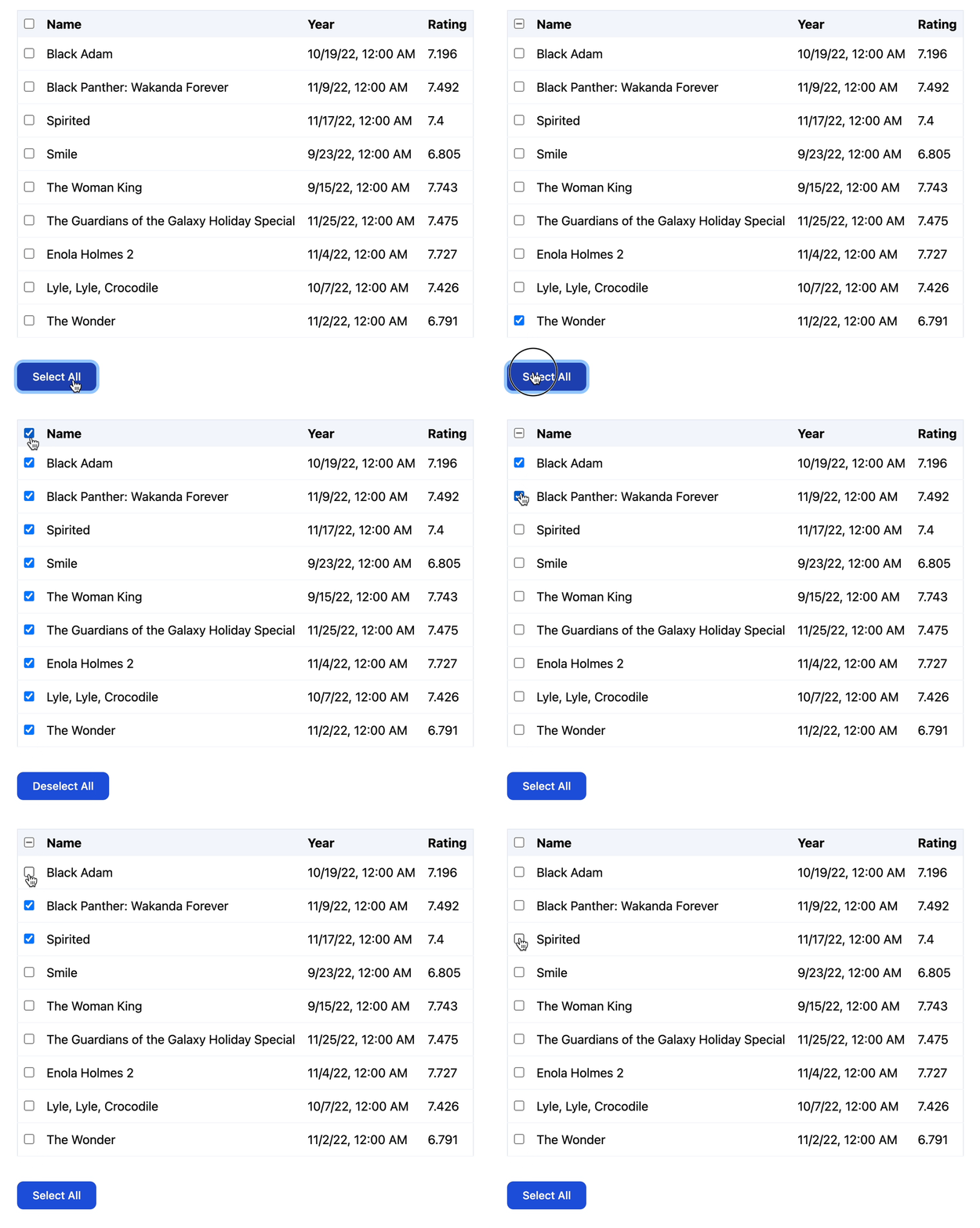
Now let's use the selection model to build a table with ability to select a row and also have a global checkbox to Select All/Deselect All.
<section>
  <table>
    <thead>
      <tr>
        <th>
          <input type="checkbox"
                  [checked]="selectionModel.selected.length > 0"
                  [indeterminate]="selectionModel.selected.length > 0 &&
                  selectionModel.selected.length < tableData.length"
                  (change)="onCheckAllChange($event)" />
        </th>
        <th>Name</th>
        <th>Year</th>
        <th>Rating</th>
      </tr>
    </thead>
    <tbody>
      <tr *ngFor="let row of tableData">
        <td>
          <input type="checkbox"
                 [checked]="selectionModel.isSelected(row.id)"
                 (change)="onCheckRowChange(row)" />
        </td>
        <td>{{ row.name }}</td>
        <td>{{ row.year | date : 'short' }}</td>
        <td>{{ row.rating | number }}</td>
      </tr>
    </tbody>
  </table>
  <footer>
    <button type="button" (click)="toggleSelectAll()">
      {{ isAllSelected ? 'Deselect All' : 'Select All' }}
    </button>
  </footer>
</section>
@Component({
  selector: 'sreyaj-exp-cdk-selection',
  template: `
    <!-- see code above >
  `,
  standalone: true,
  changeDetection: ChangeDetectionStrategy.OnPush,
  imports: [NgForOf, DatePipe, DecimalPipe],
})
export class CdkSelectionComponent {
    readonly tableData: MockData[];
  readonly selectionModel: SelectionModel<number>;

  constructor() {
    this.tableData = MOCK_TABLE_DATA;
    this.selectionModel = new SelectionModel<number>(true, []);
  }

  get isAllSelected(): boolean {
    return this.selectionModel.selected.length === this.tableData.length;
  }

  public onCheckAllChange(event: Event): void {
    const isChecked = (event.target as HTMLInputElement).checked;
    if (isChecked) {
      this.selectAll();
    } else {
      this.deselectAll();
    }
  }

  public onCheckRowChange(row: MockData): void {
    this.selectionModel.toggle(row.id);
  }

  public toggleSelectAll(): void {
    if (this.isAllSelected) {
      this.deselectAll();
    } else {
      this.selectAll();
    }
  }

  private selectAll(): void {
    this.selectionModel.select(...this.tableData.map((row) => row.id));
  }

  private deselectAll(): void {
    this.selectionModel.clear();
  }
}
Here I've used the id property to maintain the selection state, but we can use the full data also for the selection.
All selection and indeterminate state ✅
The way we check for all selection/intermediate state is:
<input type="checkbox"
      [checked]="this.selectionModel.selected.length > 0"
      [indeterminate]="this.selectionModel.selected.length > 0 &&
                  this.selectionModel.selected.length < this.tableData.length"
      (change)="this.onCheckAllChange($event)" />
We mark checked by checking if at least one item is selected (by looking at the length of the selected items):
[checked]="this.selectionModel.selected.length > 0"
Next, we set the indeterminate state by checking if at least one is selected but not all.
 [indeterminate]="this.selectionModel.selected.length > 0 &&
                  this.selectionModel.selected.length < this.tableData.length"
Selection change event ⚡️
We can configure if the selection model should emit an event on change or not. This is specified using the emitChange argument in the constructor.
Here's what the event looks like:
/**
* export interface SelectionChange<T> {
*  source: SelectionModel<T>;
*  added: T[];
*  removed: T[];
* }
* */
selectionModel.changed.subscribe((change: SelectionChange) => {
   console.log(change);
})
We'll be able to get the list of items added and removed and the model itself in case we want to do more when the selection changes.
The good thing about the selection model is that it's not coupled to any component (it's completely headless). It can be used with lists and other similar components. A small but really good utility that allows us to concentrate on the actual business logic instead of things like this.
Code and Demo 🔥
| Title | Link |
| Source Code | https://github.com/adisreyaj/sreyaj/blob/main/libs/examples/cdk-selection/src/lib/cdk-selection.component.ts |
| Demo | https://sreyaj.vercel.app/examples/cdk-selection |
| Angular CDK SelectionModel Docs | https://material.angular.io/cdk/collections/overview#selectionmodel |
| Angular CDK SelectionModel Code | https://github.com/angular/components/blob/main/src/cdk/collections/selection-model.ts |
Connect with me
Have any thoughts or questions? shoot'em below in the comments. Stay Safe ❤️



